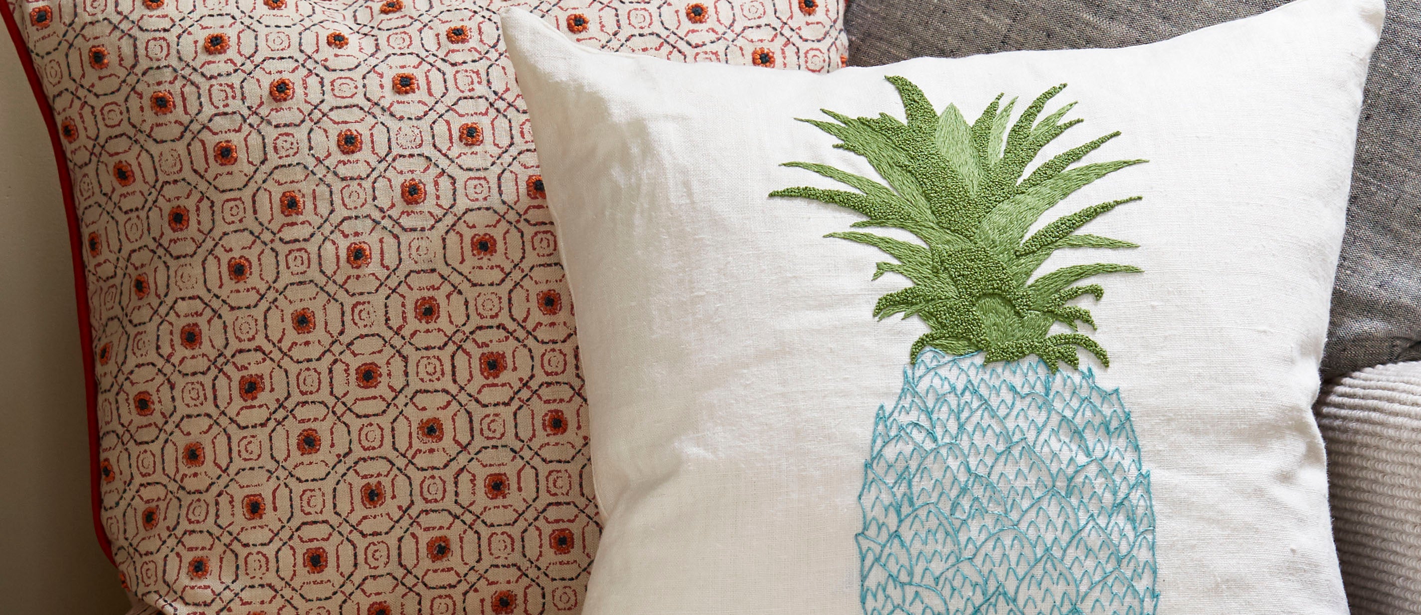
How It's Made... Linen
At Fine Cell Work, we use only the best quality yarns and cloth in our production. Linen cloth is used in some of our best selling items such as our lavender bags, our Shakespeare range and of course, our...

Originally written for Stitch Up - our bi-annual newsletter for our prison stitchers
Have you ever wondered how designers and artists find the perfect colour combination? They use colour theory. Colour theory is a practical combination of art and science that is used to determine what colours look good together. The colour wheel was invented in 1666 by Isaac Newton and shows the relationship between different colours.

Colours that look good together are called harmonious. Artists and designers use these to create a look or feel. You can use a colour wheel to find colour harmonies by using the following rules.
COLOUR COMBINATIONS
 |
Complimentary colours Two colours that are on opposite sides of the colour wheel. This combination provides a high contrast and high impact combination. Used together, these colours will appear brighter and more prominent. |
 |
Monochromatic colours This describes three or more shades, tones and tints of one base colour and provides a subtle and conservative combination. This is a versatile colour combination that is easy to apply to design projects for a harmonious look. |
 |
Analogous colours Three colours that are adjacent on the colour wheel. This combination is versatile but can be overwhelming. To balance an analogous colour scheme, choose one dominant colour, and use the others as accents. |
Warm and Cool Colours
The colour wheel can also be divided into ‘warm’ and ‘cool’ colours. The colour combinations found on a colour wheel often have a balance of warm and cool colours. Warm colours (red to yellow) are said to suggest cosiness and energy, while cool colours (blue to green and purple) are associated with serenity and isolation.
Shades, tints and tones
You can create shades, tints, and tones of a colour by adding black, grey, and white to a base hue.

Shade
A shade is created by adding black to a base hue, darkening the colour. This creates a deeper, richer colour. Shades can be quite dramatic and can be overpowering.
Tint
A tint is created by adding white to a base hue, lightening the colour. This can make a colour less intense and is useful when balancing more vivid colour combinations.
Tones
A tone is created by combining black and white - or grey - with a base hue. Like tints, tones are subtler versions of the original colour. Tones are less likely to look pastel and can reveal complexities not apparent in the base colour.
COLOURFUL FACTS


SYMBOLISM IN COLOUR
RED - Passion and Energy. Red draws attention like no other. It radiates a strong energy and is linked to deep passion. It is ubiquitously used to warn and signal caution and danger.
ORANGE - Enthusiasm and Emotion. Orange exudes warmth and joy and provides emotional strength. It is optimistic and uplifting, adds spontaneity to life and it encourages social communication and creativity.
YELLOW - Happiness and Optimism. Yellow is cheerful and brings fun and joy to the world. It makes learning easier as it inspires thought and curiosity and boosts enthusiasm and confidence.
GREEN - Harmony and Health. Green is a generous, relaxing colour that revitalises our body and mind. It balances our emotions and leaves us feeling safe and secure. It also gives us hope and promises prosperity.
TURQUOISE - Calmness and Clarity. Turquoise stabilises emotions and increases empathy and compassion. It emits a cool calming peace, gives us a boost of positive mental energy that improves concentration.
BLUE - Trust and Loyalty. Blue has a calming effect on our psyche, that gives us peace and makes us feel confident and secure. It dislikes confrontation and too much attention, but it is honest and reliable.
PURPLE - Spirituality and Imagination. Purple inspires us to divulge our innermost thoughts, which enlightens us with wisdom of who we are and encourages spiritual growth. It is often associated with royalty and luxury, and its mystery and magic sparks creative fantasies.
PINK - Love and Compassion. Pink is kind and comforting, full of compassion, and makes us feel accepted. It’s friendly and brings joy and warmth into our lives. It is also bursting with pure romance.
BROWN - Stability and Reliability. Brown is dependable and comforting. A great counsellor and friend full of wisdom. You can count on its help if you need an honest opinion, support, and protection.
BLACK - Power and Sophistication. Black is an incredibly strong and intimidating colour that exudes authority and makes us feel secure and protected. Often seen at formal and prestigious events, this mysterious marvel arouses and seduces our senses with its elegance.
GREY - Compromise and Control. Grey is neutral, conservative, and unemotional. It is practically solid as a rock, making it incredibly stable, reliable, and calming. It has a peaceful, relaxing, and soothing presence.
WHITE - Purity and Innocence. White is a true balance of all colours and is associated with cleanliness, simplicity, and perfection. It loves to make others feel good and provides hope and clarity by refreshing and purifying the mind. It also promotes open-mindedness and self-reflection.
0 comments